Introduction
A case study on designing a cross platform digital solution for communities and their residents from the ground up.
Background
The Chamberlain Group is one of the world’s largest if not the largest manufacturer of garage doors and gate controllers. Their hardware products were top of the line but the software experience was lacking, with user experience becoming a significant differentiator, a change could not be delayed. Smaller competitors could not meet the wide ranged need for an end to end solution but were headed in the direction. This would have posed as a direct challenge to us. With this initiative they were willing to re-design their platform from the ground up give their customers the edge they had been asking for.
Table of Contents
The Architecture
“For every minute spent on organizing, an hour is earned”
— Benjamin Franklin
"Unfortunately the opposite is also true…"
- Me

Jenga - a game where you progressively create a more unstable structure
The Problem
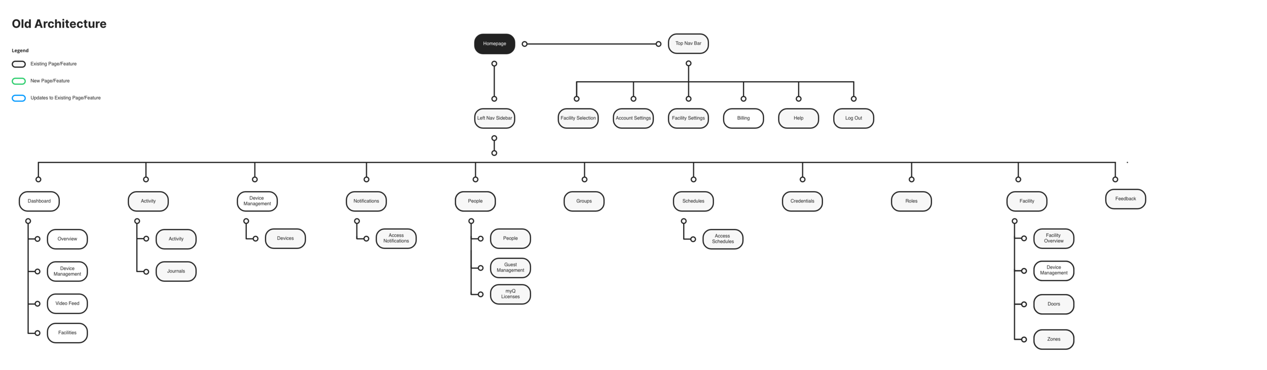
Overtime, multiple teams kept adding features to the site with no clear overall organizing principles.
The company had also slipped into a ‘build trap’. Focusing on shipping faster (output) rather than the final experience.
This resulted in a very confusing navigation ruining not only the user experience but also internal productivity and engineering work (badly designed features introduce bugs because they are hard to model and code).
Think of it like a Jenga game which had gone on way too long.
“Confusion and clutter are the failure of design, not the attributes of information.”
— Edward Tufte
Goal:
Re-architect the platform for a more user-friendly, stable and scalable experience.
The Approach:
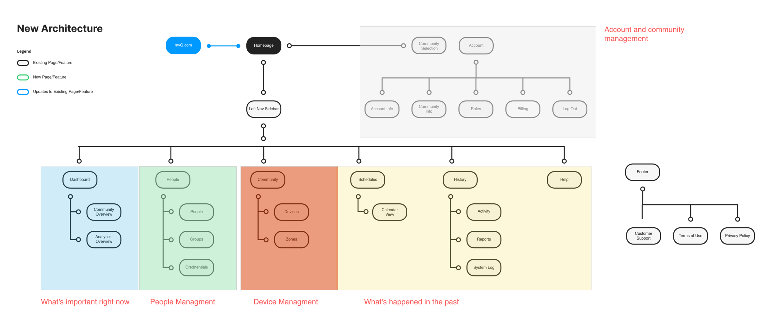
Using research, analytics and core IA principles; we prioritized and re-architected the navigation for a vastly improved site navigation experience.
We organized the website based on how community managers think of their community.
DASHBOARD: What’s coming up and happening now? - Is everything okay?
PEOPLE: I need to manage people (add, assign keys, etc)
DEVICES: I need to manage devices (device mgmt, creating zones)
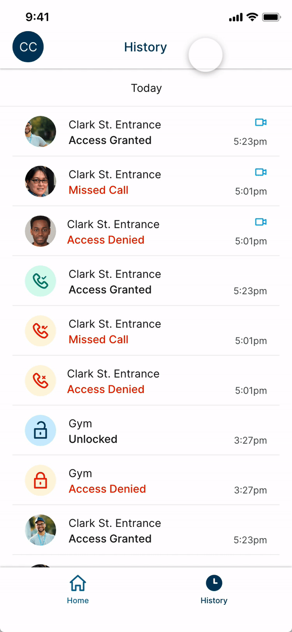
HISTORY: What’s happened in the past (security, traceability)
ACCOUNT: I need to manage my account and billing
HELP: I need help
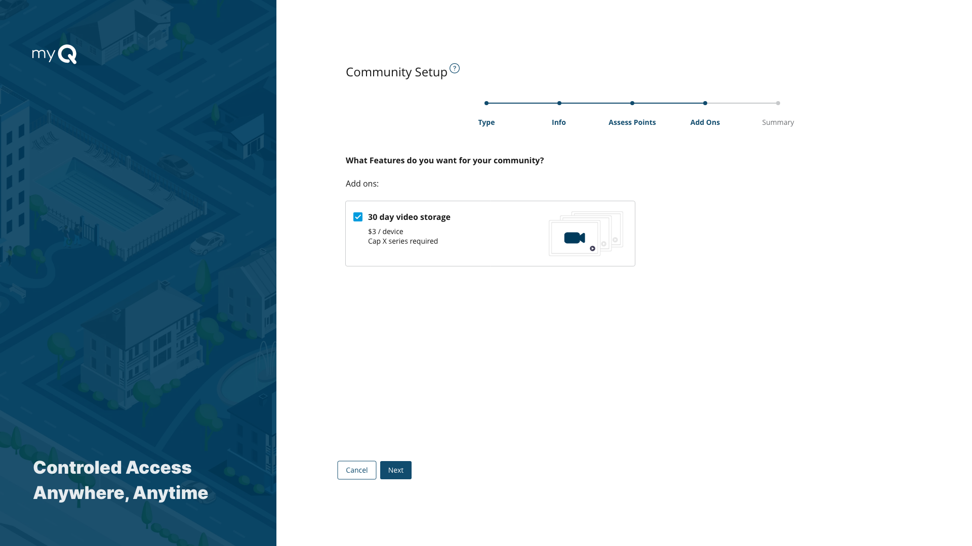
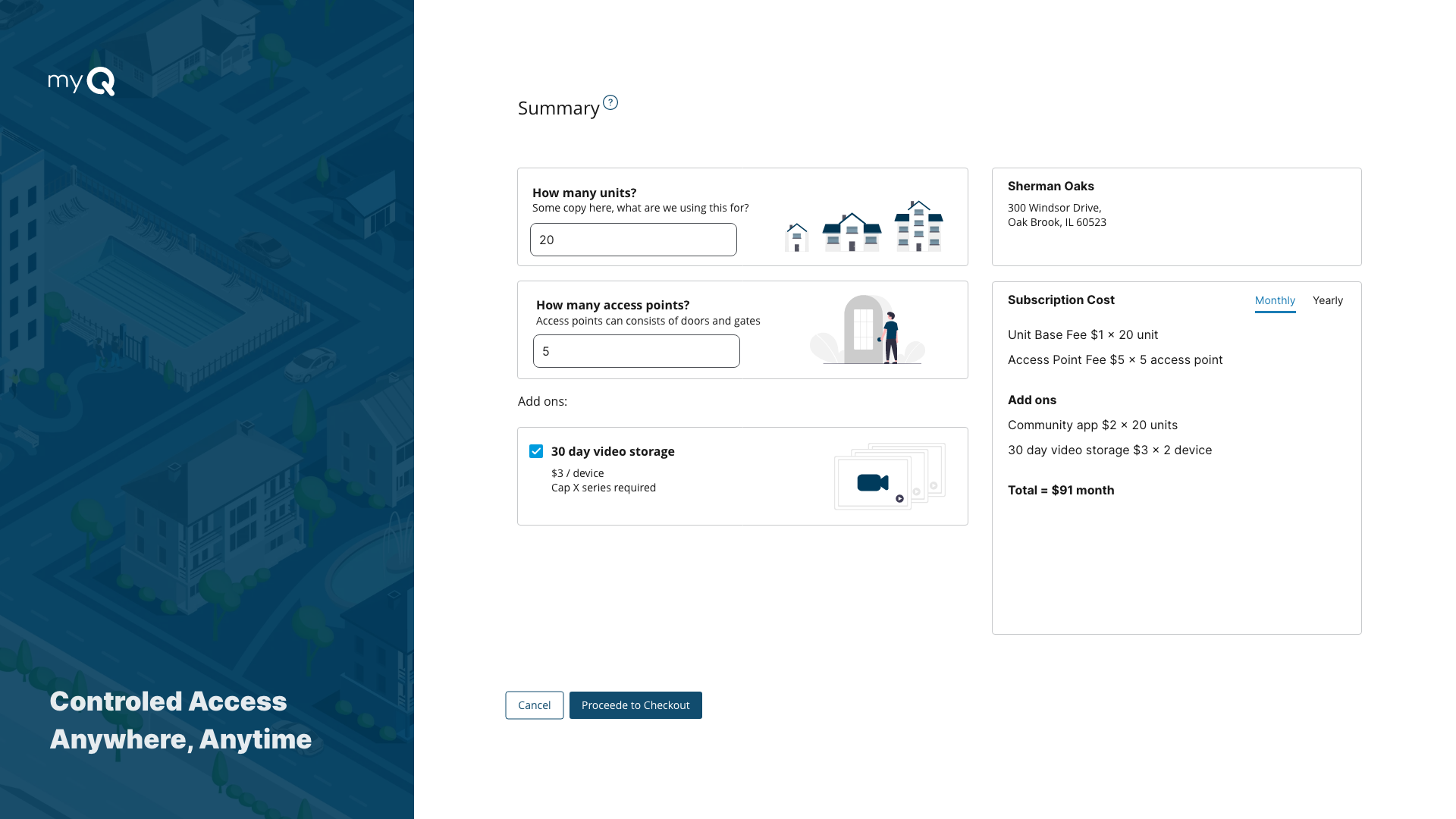
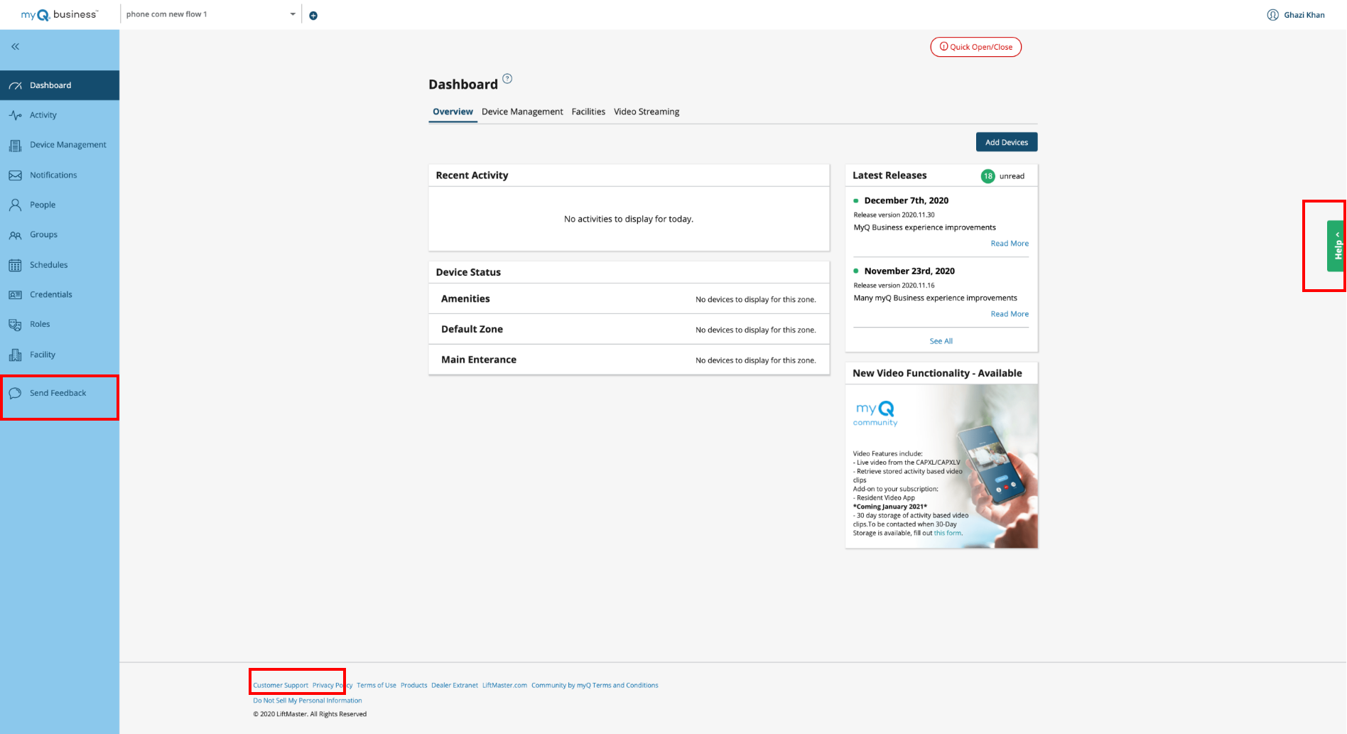
2. Simplifying the setup and buying process
“The ability to simplify means to eliminate the unnecessary so that the necessary may speak.”
— Unknown
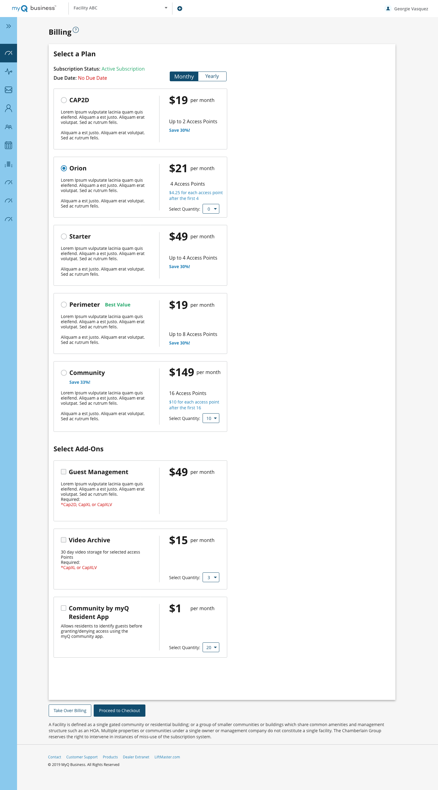
The billing page had turned into a confusing mess.
The Problem
The current process hadn’t changed since the company first developed the platform 10 years ago.
It took 5-7 days to setup a new community. The process was all offline and involved long calls and surveys passed back and forth to figure out the right combination of hardware, subscriptions and plans for the community.
There was confusion on what hardware works with which software plan. It was not designed how users thought of their community’s needs, but instead more of a catalog of features launched over the years.
Goals:
1. Customer should be able to setup an online community themselves, eliminate the need to call a dealer or sales personal.
2. Simplify the billing plan
Solution:
We went through the surveys and listened to the calls between sales and customers. We narrowed down the questions to which are important. By working with the business and sales teams, we were able to redesign the plan to make the process hardware agnostic, just have a base fee for connecting door/gates or units.
This allowed us to simplify the billing page from 12 plans to just ONE hardware agnostic plan. We moved device specific add ons to ‘add device pages’ to eliminate the confusion of hardware compatibility.
In the end, we eliminated all paperwork, surveys or need for any calls. The 5-7 days process could be done in minutes now online.
This was a good reminder ‘UX’ is the total experience a person has when interacting with a company, it cannot be designed, it is experienced. The total experience is shaped by all parts of a company, from business strategy to development; it cannot be designed by a single or a team of designers.
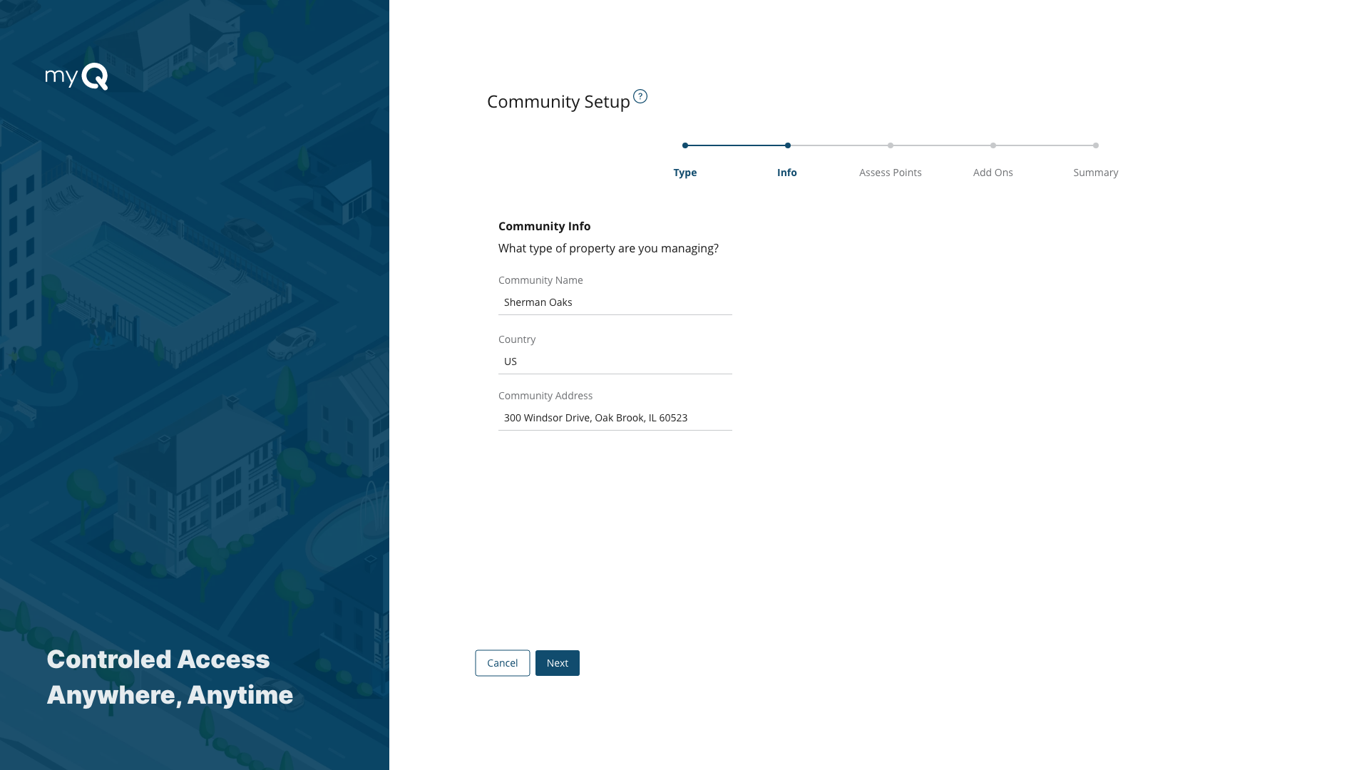
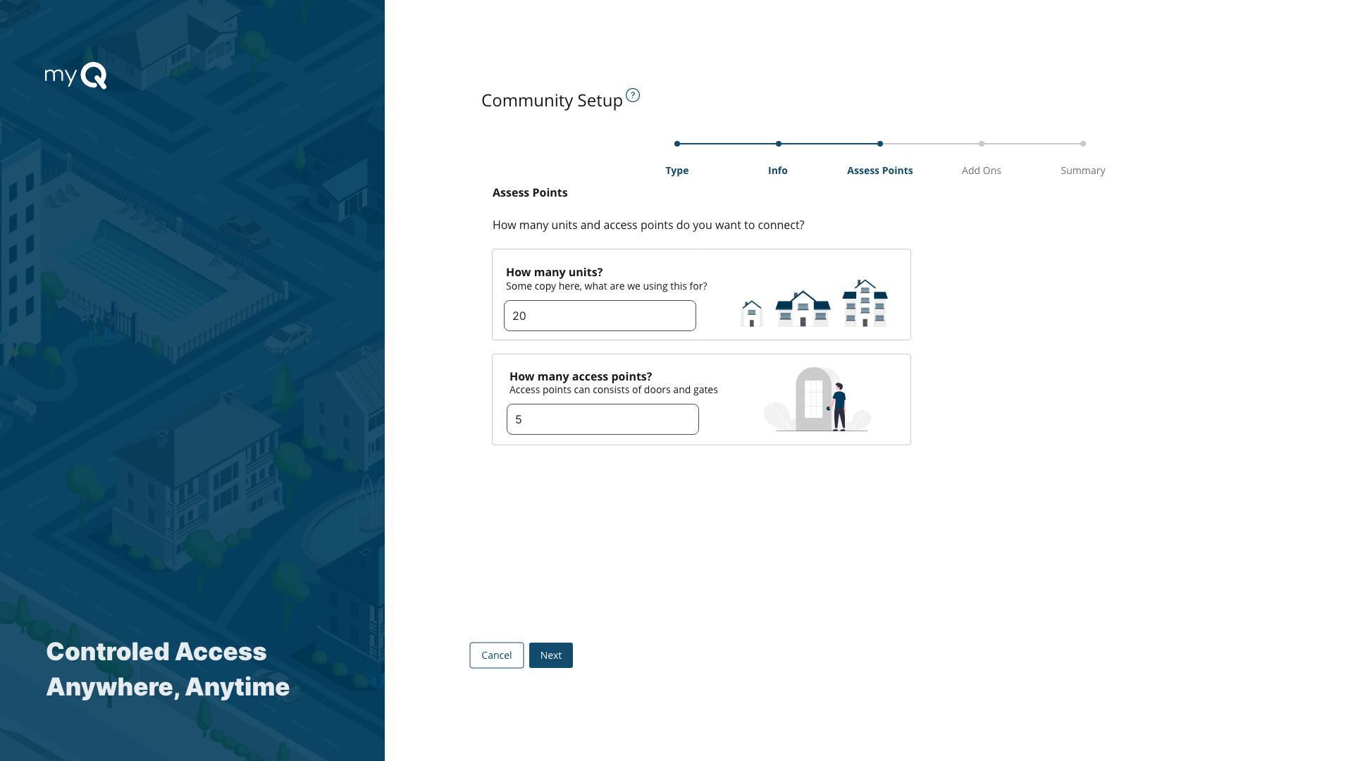
The new community setup and billing process (slideshow)
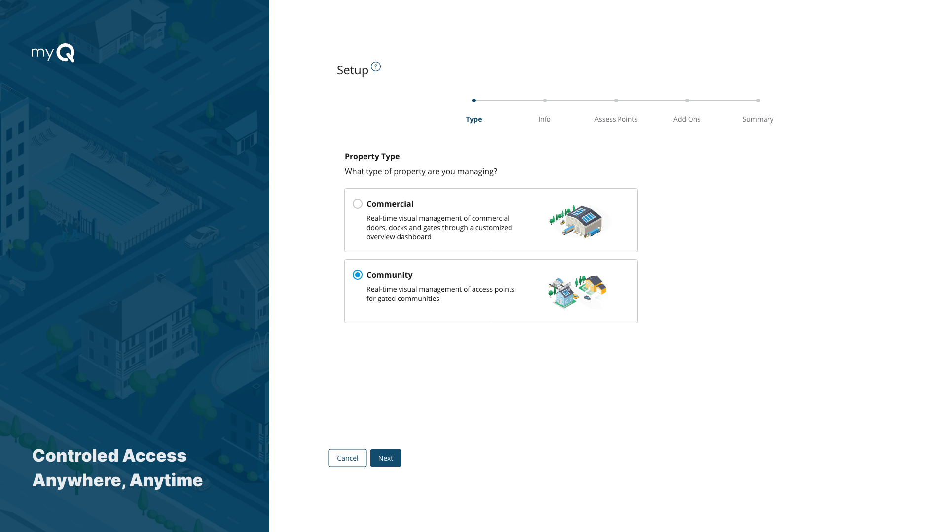
A slide show of the simple 5 step wizard designed to replace the 5-7 day offline process
3. Community managment
“A plan is what, a schedule is when. It takes a both a plan and schedule to get things done”
Peter Turla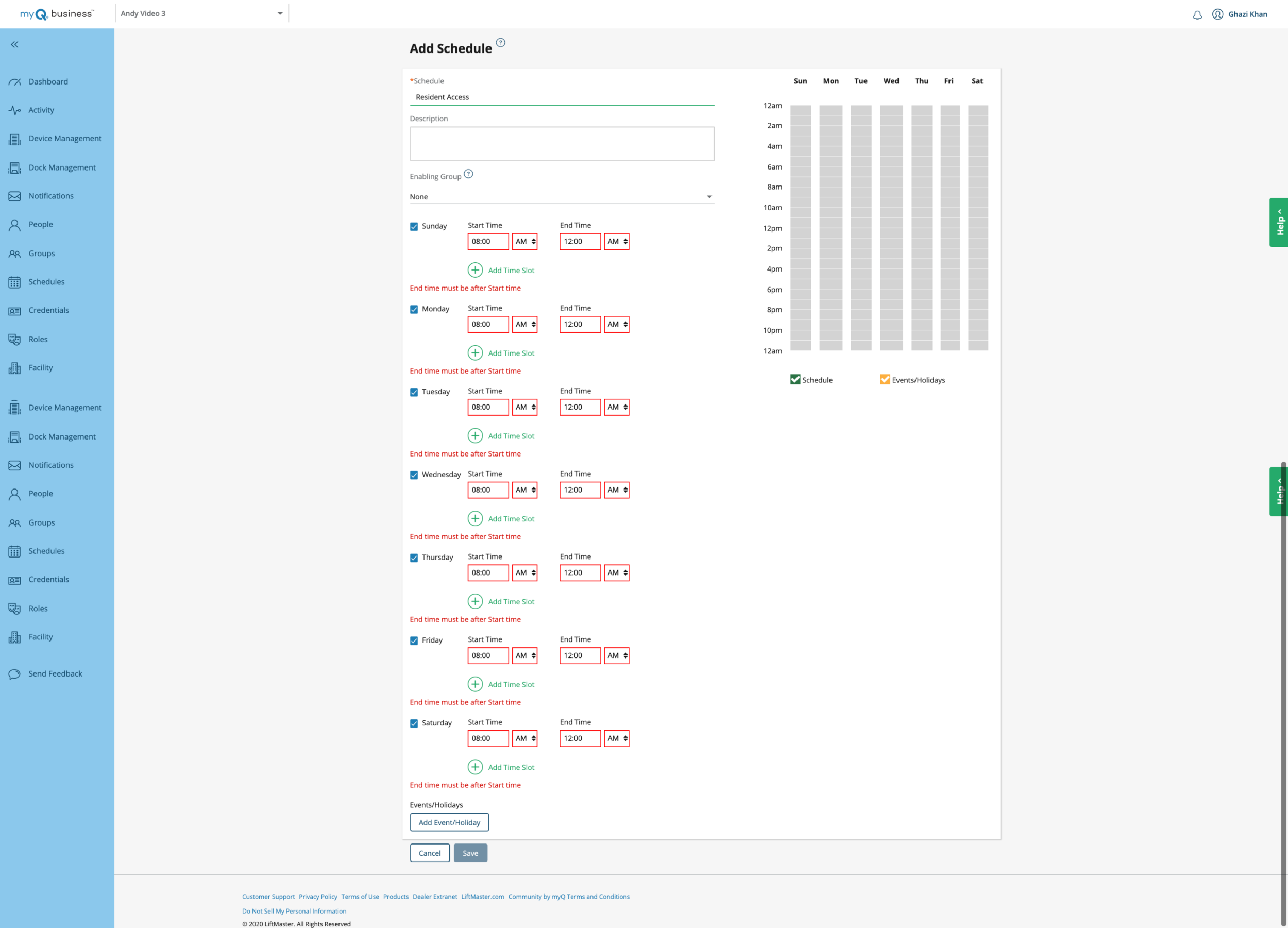
The problem with ‘Scheduling Access’
Schedules had been designed as ‘Just a block of time which can be applied through out the platform’
While technically true from a system point of view this is not how the users think of a schedule.
A schedule could have up to 70 time slots and applied to 8-9 different things on the platform, everything ranging from notifications to a ‘do not disturb feature”.
While this offered some unique complex functionality. It got so complex that when we tested there was a 100% failure rate.
All the screens the community manager had to go through to give access to their residents in their app
Goals:
Let managers easily access schedule for groups
Let managers easily quickly and easy see existing schedules
Remove unnecessary complexity
Solution:
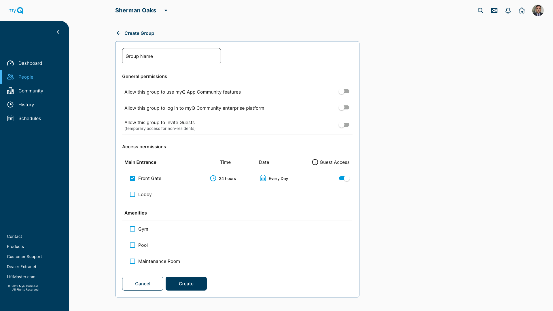
How do community managers think of schedules?
“Who can go where and when?”
Instead of thinking of schedule at is own entity… we thought of this just a ‘access times’.
We redesigned the group settings page, and allowed the community manager to set the ‘access times’ for that group on that screen, so everything is always in context. Not only did we make it easier, we were able to eliminate a whole section of the website and unnecessary complexity without sacrificing any functionality.
One page to solve it all, letting community managers schedule groups right on the groups page and have granular schedules.
"Perfection is achieved not when there is nothing more to add, but when there is nothing left to take away." —
Antoine de Saint-ExupéryBefore and After: We were able to simplify the functionality of all these sections into one simple page
We designed a ‘group’ page, which offered the same functionality of all the screens below.
The community manager could
- setup permissions for the group and their guests
- setup ‘where’ this group can go ‘when’
- invite this group to the myQ resident app
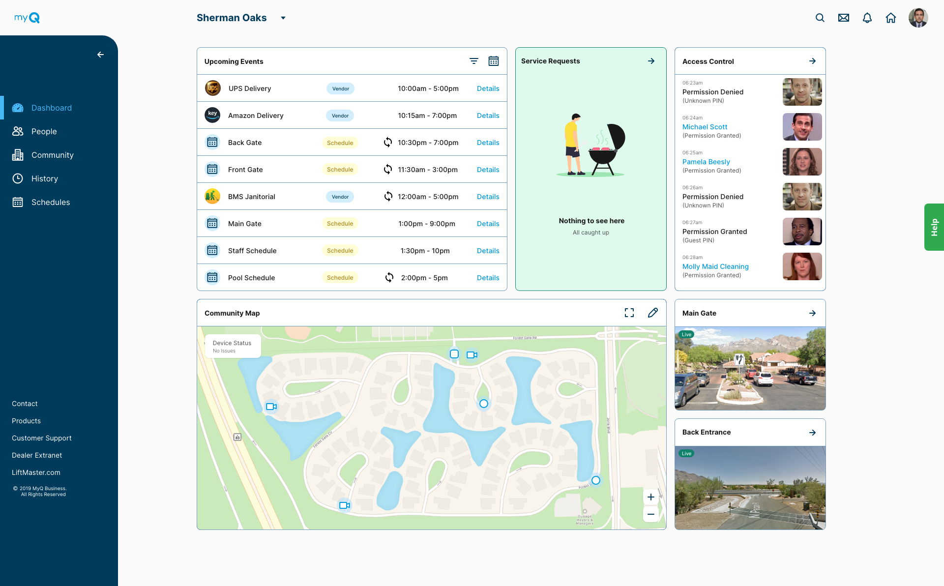
Dashboard re-design
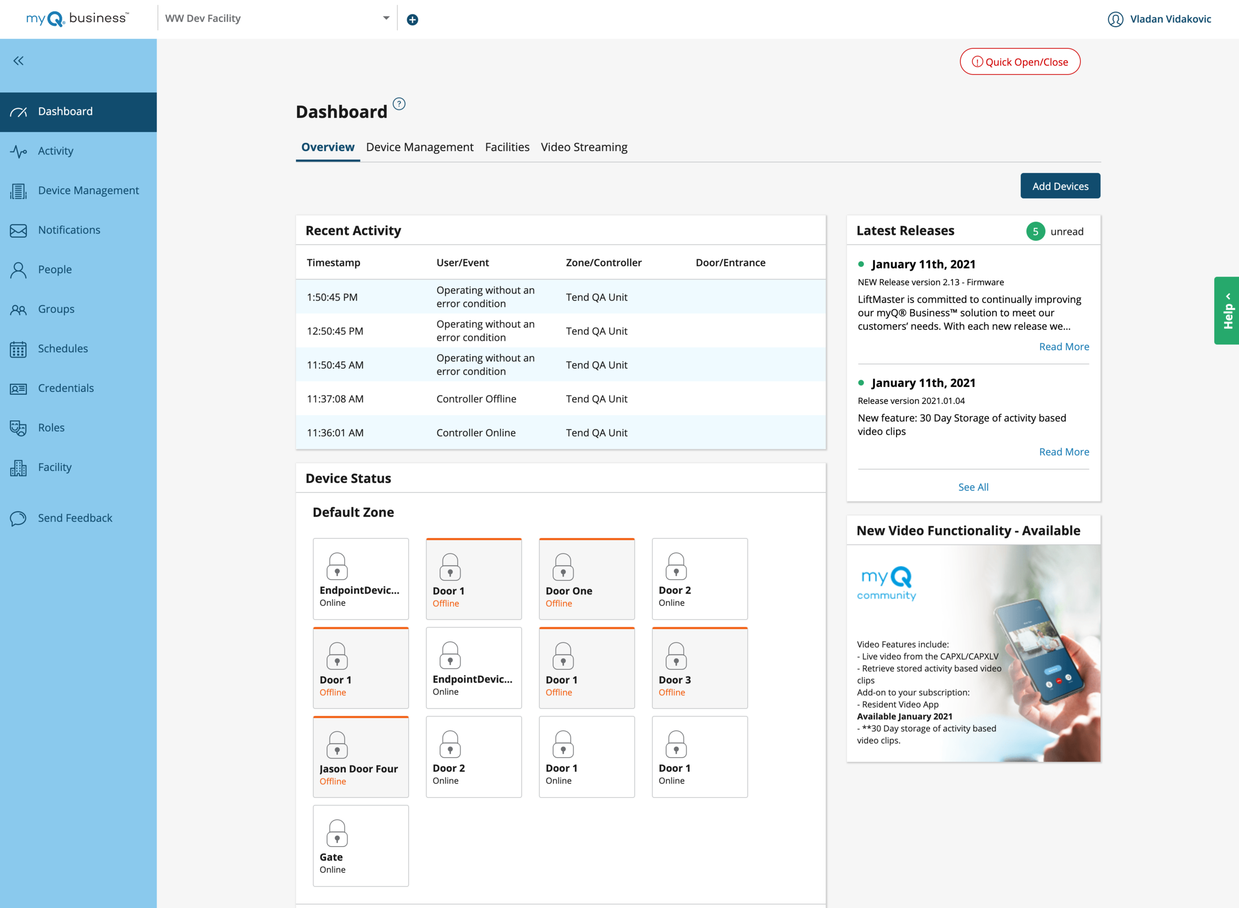
While the dashboard did show some useful things like recent activity and device status, it also showed a lot of information a community manger wouldn’t consider the most urgent when starting their day… like release notes and advertisements.
So we asked community mangers what mattered most to them, and they responded with
“Is my community safe?”
“Things I have to do attend to or take action on next”
The Solution
How could we show community safety?
We added cameras to our hardware, and live video feeds on the dashboard
Created notifications for door/gate damage or unauthorized entry, with video clips attached.
Show live status, location and state of each door/gate
How could we help the community make his job easier?
A filterable list of upcoming schedule, guests, deliveries and events
See daily list of any maintenance requests by customers so they can be quickly addressed
See if any device is not working (get notified and take quick action)
Quicker communication with staff, residents
Easily search for things in community (global website search)
“Content precedes design. Design in the absence of content is not design, it’s decoration.”
The new dashboard focused on showing the right content at the right time.

The new dashboard: Showing the right information at the right time.
4. The resident experience
“The ability to simplify means to eliminate the unnecessary so that the necessary may speak.”
— Hans Hofmann
Removing the need for keys
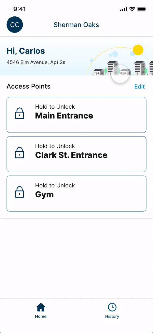
Eliminating the need to move every time you have a guest
Eliminating the uncertainty of ‘did anyone visit when I wasn’t home’
5. Helping, guiding and listening to users (in progress)
“Above all else, align with customers. Win when they win. Win only when they win.”
— Jeff Bezos
After all this effort we wanted to create an efficient feedback loop between the company and users, with two simple goals.
1. Guide customers to contextual help and let them share feedback quickly and seamlessly.
2. Make quick incremental changes prioritized based on user feedback, instead having to re-design the whole platform again.
Finding the right problems to solve:
We met with the Customer support team, and worked with them to identify problems, used ‘how might we’ statements to come up with improvements.
Here is a summary of all the issues we identified with them and our ideas
“75% of the calls are for troubleshooting”
75% of the customers are calling the customer service, to ask for guidance despite all this information being available online.
Issue: Find-ability, information spread over different locations
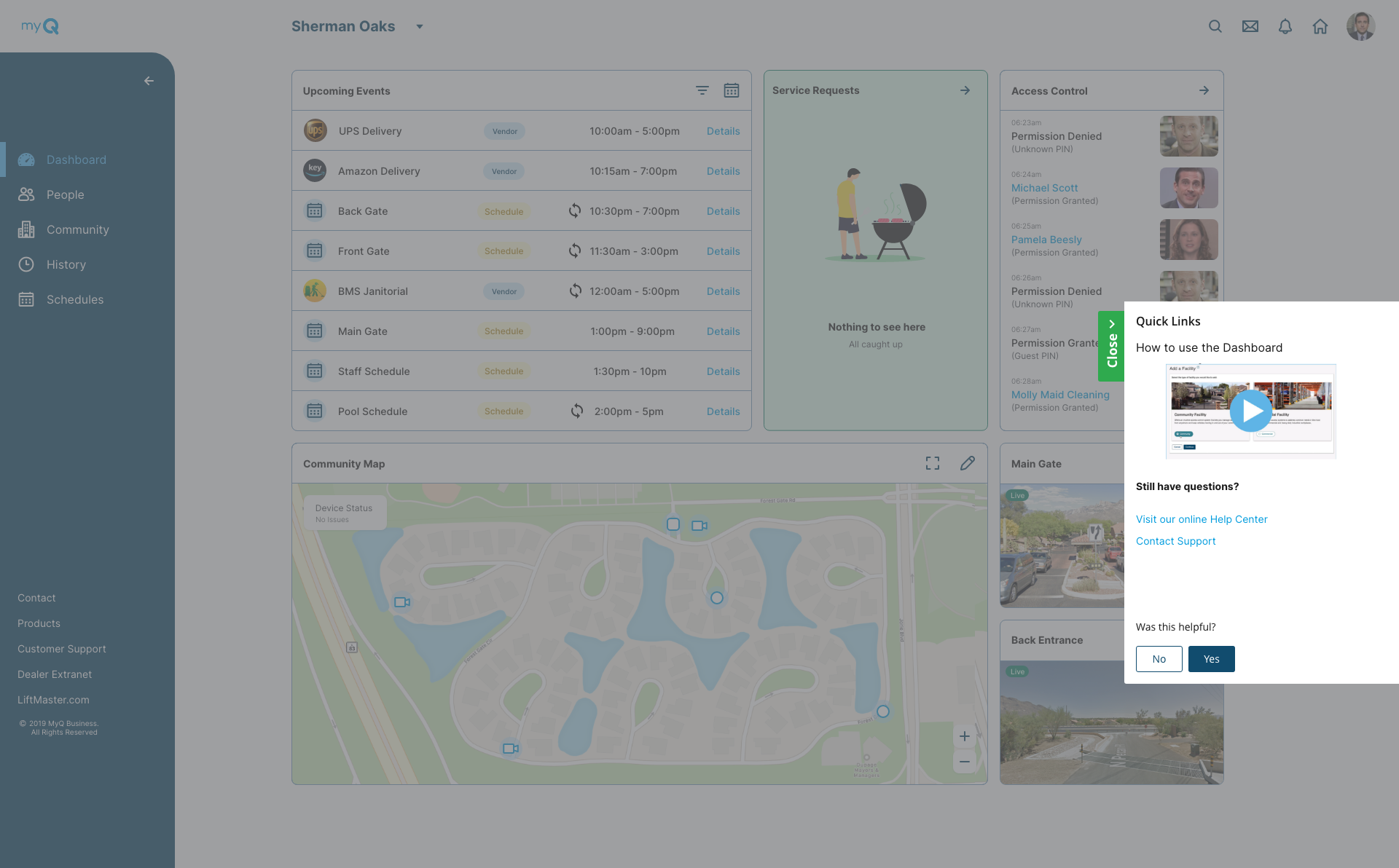
Solve: Make troubleshooting easier to find, and always contextual
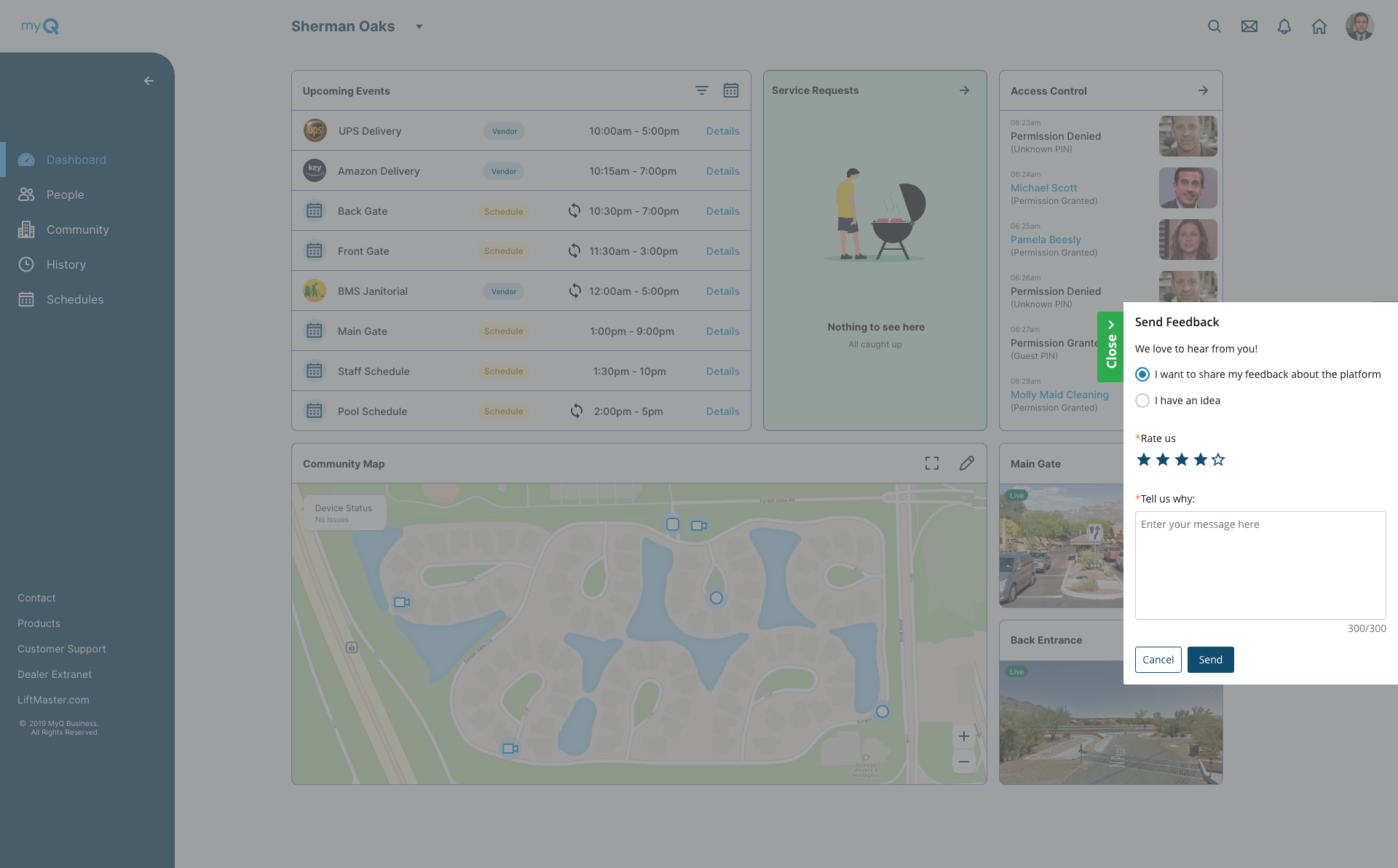
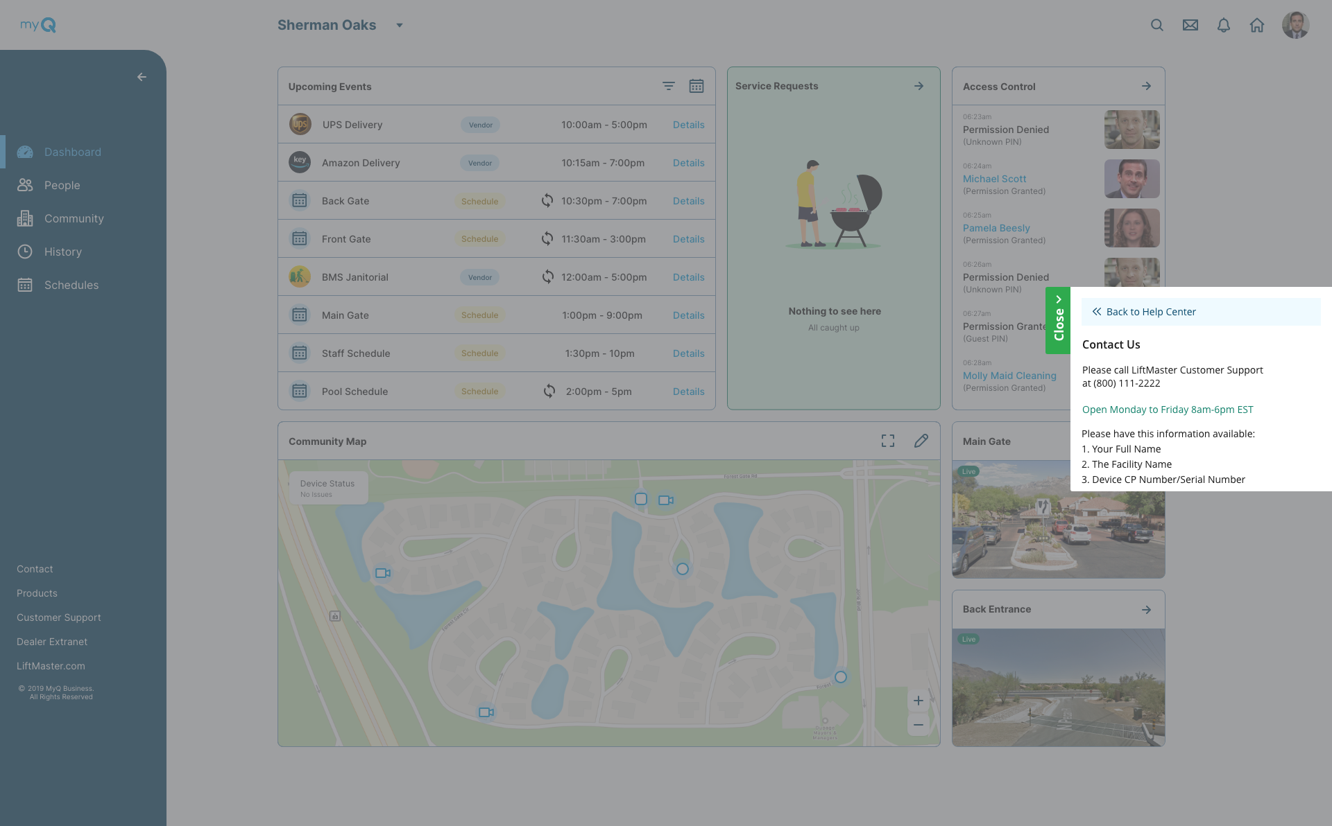
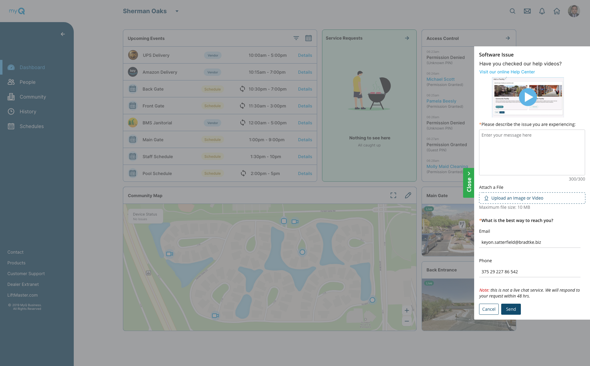
“People confuse feedback form for a chatbot, expecting immediate responses”
Issue: Setting false expectations. Customers think it’s a chatbot, and aren’t told about hours of operations. Leading to more frustration.
Solve: Inform the user of hours of operations and expected time of response in the UI. Start research on creating efficient chatbot.
“If we can capture more useful information about the customer,It would help us save a lot of time, and reply in timely manner”
Information we could collect, so we don’t have ask the user again, to save time on both sides.
Solution:
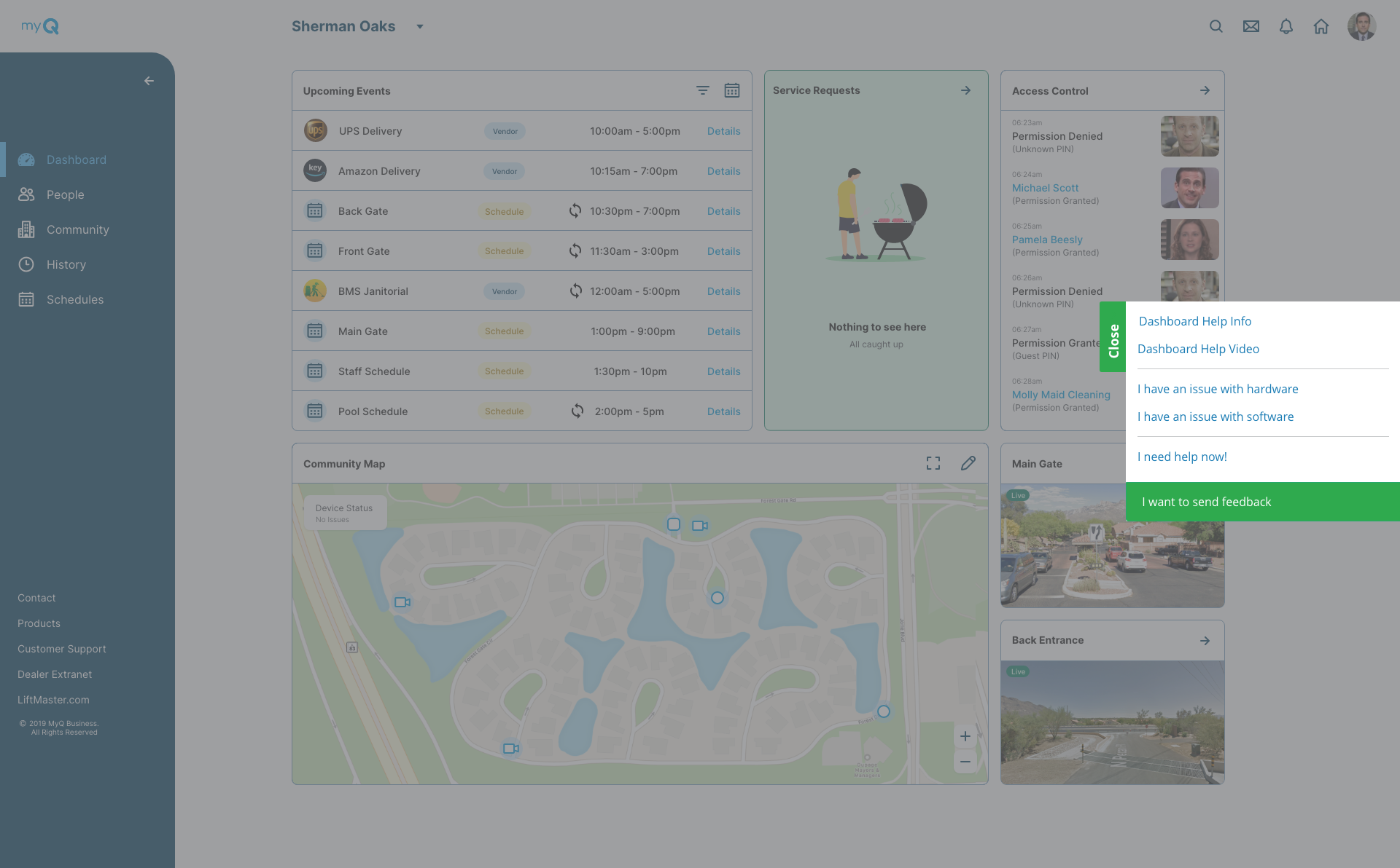
Improving Find-ability the existing design, there were 3 different places the user had to go to leave feedback, contact customer support and look for generic help.
We moved everything under one accessible place under ‘Help’.
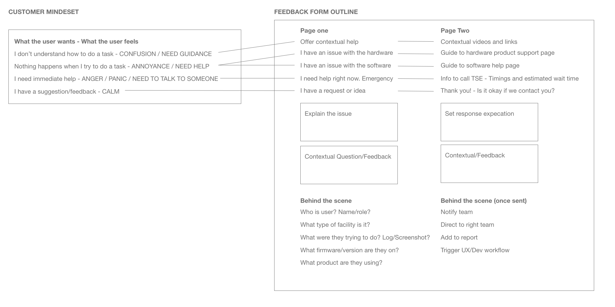
Empathize with the user
In order to help provide the user the right information at the right time, we had to understand their ‘mind set’ at the moment as well.