Ford: Build and Price
Designing an online responsive experience allowing users to customize, price and locate any Ford Vehicle on any device.
GOALS
Help users find the right vehicle, quick and easy
Dynamic customization, lets users customize how they want (non-linear process)
Users shouldn't need to interrupt their configuration process to fill knowledge gaps
Help users learn and understand the best way to pay for their vehicle
Help users locate, test drive and buy the vehicle they built
Keys to success
Mobile First
Modular Design: Design responsive components, not pages.
Thinking mobile first forced us to prioritize all information from a users perspective. Forcing us to ask tough questions like - What's more important to the user? - the vehicle image vs pricing, feature imagery vs feature descriptions etc).
"Modular design, or "modularity in design", is a design approach that subdivides a system into smaller parts called modules or skids, that can be independently created and then used in different systems." ... kind of like LEGO.
We designed a library of responsive components eg navigation components, vehicle feature cards, pricing components etc. Each component had a unique design for small, medium and large screens.
Designing a component library helped keep our design responsive, consistent, organized and easy to develop and launch on a global scale.
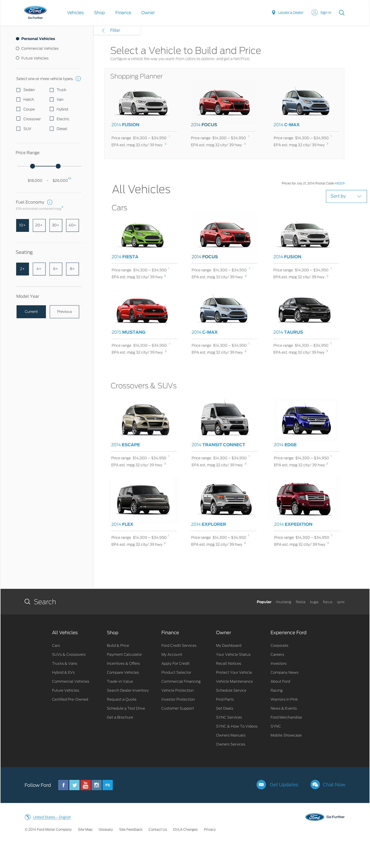
HELPING USERS FIND THE RIGHT VEHICLE, FAST AND EASY.
Keys to success
Understanding how people look for cars, not how car companies think of cars
Right level of detail and information at the right time
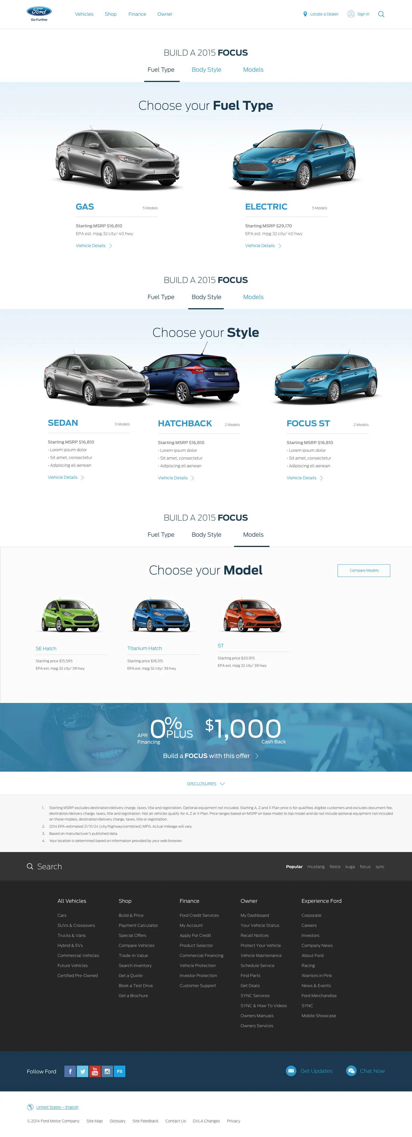
One of the first big questions we faced was ... "Should we show results at a Vehicle Level or Model Level?"
- Vehicle Level: Ford Mustang, Ford Fusion, Ford Fiesta, Ford Focus
- Model Level: Mustang GT, Mustang FastBack, Focus ST, Focus RS
After doing some research we learned two important things...
In a lot of global markets consumers weren't familiar with Ford vehicles, let alone model names, so showing all the vehicles at model level would simply confuse the user who does not understand the difference b/w the models.
We also learned that the two biggest decision factors in consumers minds are:
a) Vehicle Type (car, truck, SUV, hybrids )
b) Budget
So we basically let the research data decide and prioritize the filters.
(Sometimes it's just better and faster to ask, rather than keep guessing)
We designed the showroom to show Ford Vehicles (not at a model level), but let the user filter down to their vehicle of choice using the filters they were most familiar with.
HELPING USERS PICK THE RIGHT MODEL
Key to success:
Think backwards, starting from the user not the product
While showing you have a lot more products might seem like a good idea, it might also overwhelm the user if they don't fully understand what they are seeing.
As we learned earlier a lot of global markets are not familiar with Ford vehicle model names like ST, SE and Platinum and with the visual difference between them so subtle, the user has little information to make a decision.
But people usually know which body style (hatchback, sport, sedan) or fuel type (gas vs electric vs hybrid). So we designed the model picking process to match how most people think of cars.
"Show the user what they want to see, not what you want to show them." Instead of showing all the models at once. We let the user make simple choices like 'Fuel Type', 'Body Style' in a step by step process to get to them the right model.
Right information, in the right context at the right time is key.
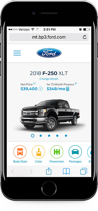
DYNAMIC CUSTOMIZATION
Keys to success
- Mobile First
- Think outside the box, think different
- Leverage what's around you, what are people using and enjoying?
Once again we started mobile first, which forced us to prioritize and scrutinize each piece of content from the users perspective.
Instead of looking at other vehicle configurations and customizers out there (because all most of them had a linear, step by step process which was not the direction we wanted to take). We tried to think a little different...
“What's the thing that people customize on their phone the most?" - Pictures, Images and Video.
With the rise of social media, people all over the world of all ages, everyone likes to take, edit and post pictures. Majority of them are using the most popular apps. So that's where we started and got our inspiration from...
Leveraging those familiar design patterns but to customize cars instead of pictures we radically reduced the learning curve for new users. As well as making customizing cars a fun and dynamic experience.
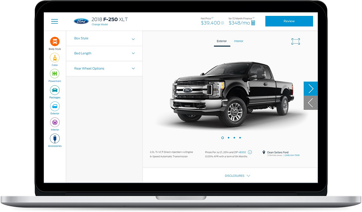
Right information at the right time
Keys to success
Understand what the decision points are and when they happen
Educate users at decision points
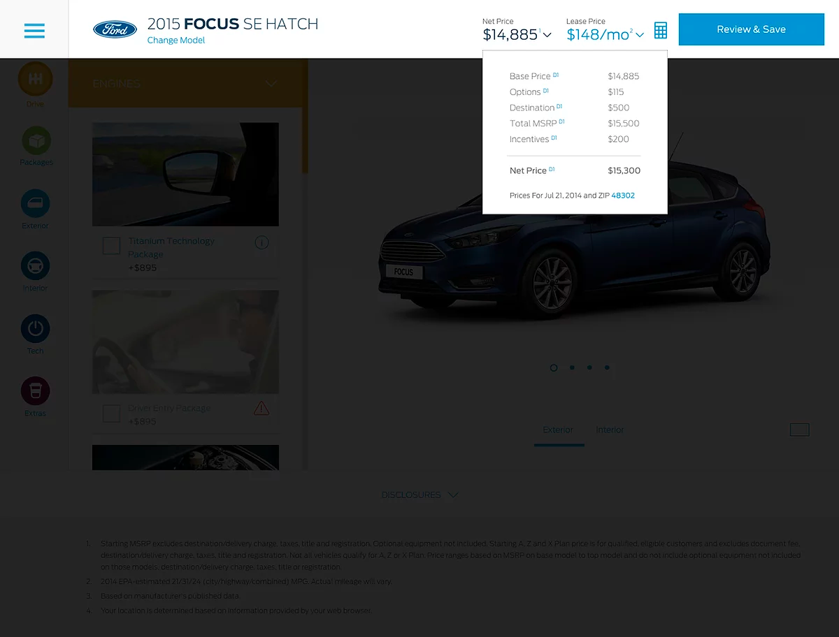
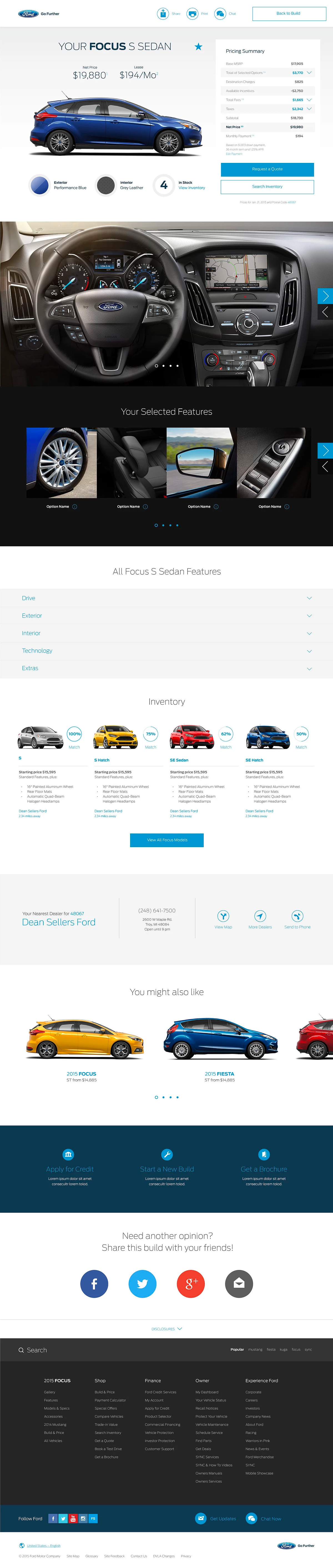
From previous research we knew pricing was one of the key decision points.
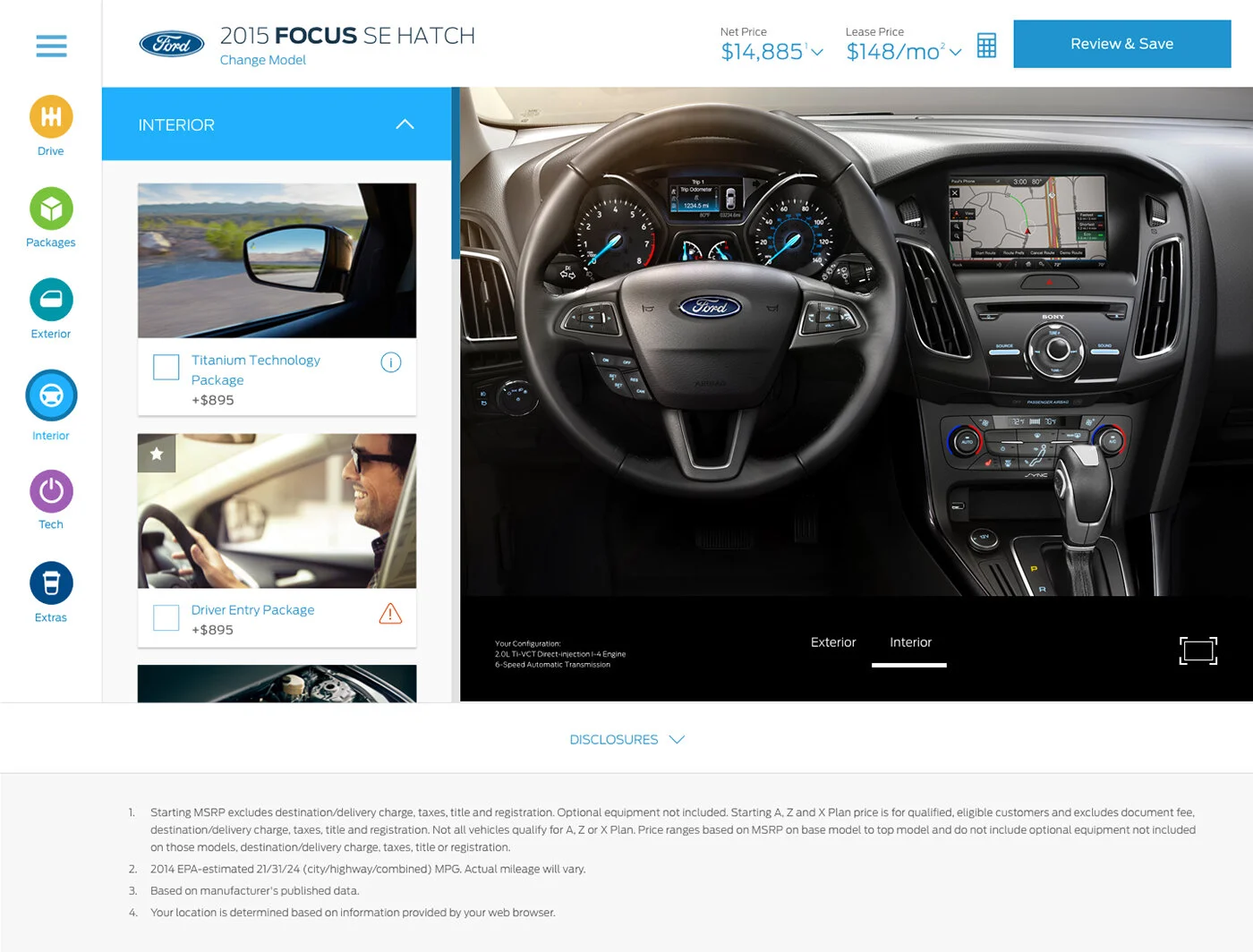
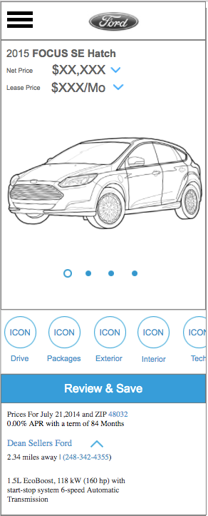
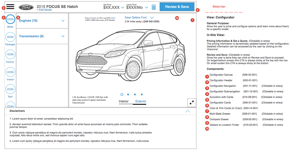
Hence pricing had to be prominent and dynamic. We designed to include the price:
1. On every feature card
2. Net Price and Lease price ever present on top, dynamically updating.
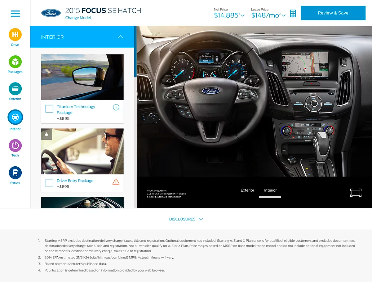
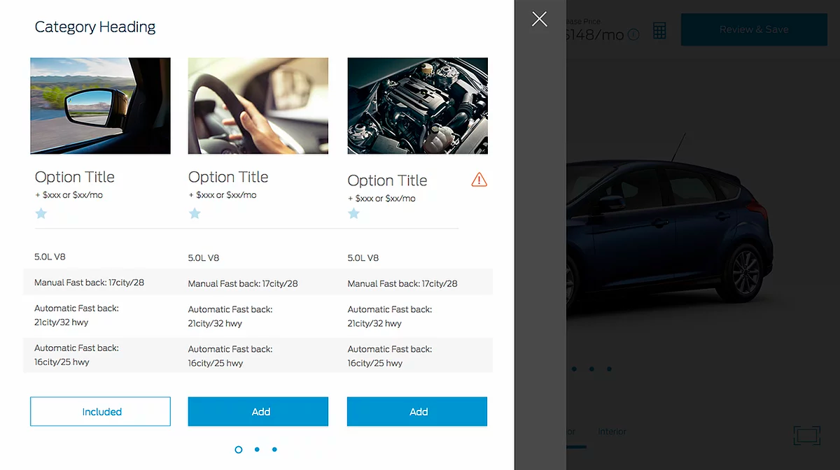
Other major decision point was the vehicle features themselves. We designed feature card (components). The vehicle feature card (seen below the interior dropdown) included an image, name, price, i-ball (for additional information)
We introduced the i-ball, incase of the scenario the first 3 attributes were not enough for the user to decide. Tapping the i-ball would show details about the future in a non-intrusive way. We also designed to let user compare similar options like Engines.
An informed user, is a happy user.
Test, Drive and Buy it
Key to success
Organization, Clarity and Transparency
Think out of the device, think real world
Understand the complete user journey, not just the digital journey
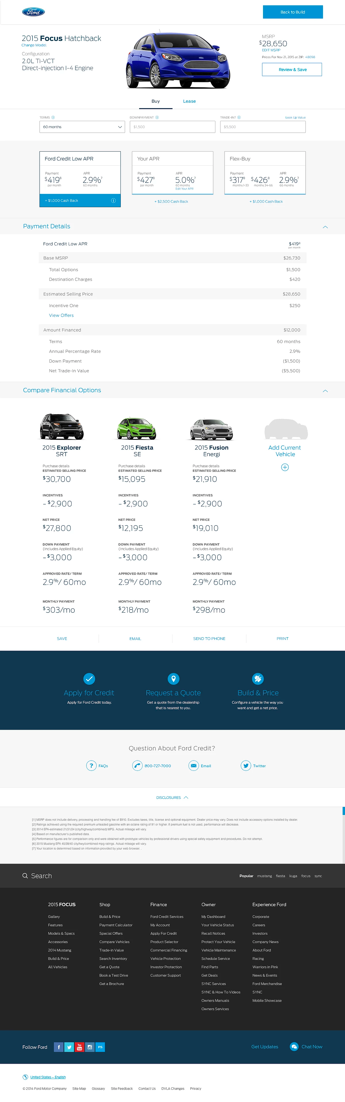
We designed a Payment Calculator to help the user understand and compare different methods of payments and let them decide what works best for them.
The Pricing Cards were designed to include all the important decision factors, monthly Payment, APR and incentives. Organizing all these important pricing factors, clearly side by side would help the user avoid a lot of number crunching and feel confident in their end decision.
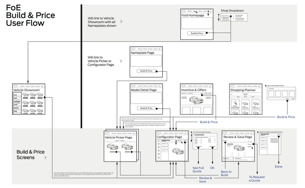
Even though the had a fully customized and priced car, we understood that was not the end of the customers journey. After all this hard work we didn't want the user to end up at a 'dead end' on the website.
Next typically (in the US at least), users would have to contact different Ford dealerships and ask them one by one of they have a car that matches what they customized.
We designed the Inventory & Locate a Dealer component. This component would locate your nearest Ford Dealer and show the best matching vehicles in the inventory. The user could email/print all the vehicle and price details for the dealership as well. Feeling confident about their vehicle and price. The user could then schedule a test drive and if all goes well, buy the car!
TESTING AND FEEDBACK
We tested both our mobile and desktop designs in 3 global markets (US, EU and Asia). Here's the overview / summary excerpt directly from their report.
"Shoppers liked the Ford Global Build & Price tool. Many had not used a similar tool before and they liked it's interactive and visual nature. Shoppers liked the Build and Price exposed them to features and pricing, arming them with knowledge and confidence prior to dealership visits. Shoppers said the experience of building their vehicle made it feel more real and excited them to own a new car"
Visit the Site →